
2026 Branding Book
The 2026 Xandermar Branding Book defines the visual, verbal, and digital standards used across xandermar.com, social media, proposals, presentations, advertising, and customer-facing materials.
The purpose of this guide is to ensure that every Xandermar experience feels consistent, professional, modern, technical, and business-focused.
Brand Overview
Company: Xandermar LLC
Primary Website: www.xandermar.com
Primary Brand Positioning: Xandermar helps businesses improve efficiency, increase productivity, generate leads, automate operations, and build high-performance digital platforms through artificial intelligence, web engineering, and business automation.
Core Capabilities:
- AI lead generation and prospecting
- AI sales outreach and follow-up automation
- AI website chatbots and customer service assistants
- AI content marketing and SEO automation
- AI CRM, quoting, and proposal automation
- Web application development
- Drupal and WordPress development
- Website migrations and modernization
- Continuous integration and deployment
- Business process automation
- Technical consulting
Brand Personality
The Xandermar brand should feel:
- Professional
- Modern
- Technical
- Confident
- Practical
- Results-oriented
- Direct
- Dependable
- Innovative without being gimmicky
The brand should communicate technical expertise while remaining understandable and accessible to business owners, decision-makers, and non-technical customers.
Brand Promise
Xandermar delivers practical technology solutions that help businesses work faster, operate more efficiently, serve customers more effectively, and generate measurable growth.
Brand Tagline
Knowledge Is Power, Enthusiasm Pulls The Switch.
The tagline may be used in:
- Website hero sections
- Proposal covers
- Presentation title slides
- Social media graphics
- Email signatures
- Printed marketing materials
The tagline should not overpower the company name or primary page message.
Logo System
Primary Logo Mark
The 2026 Xandermar logo is a modern circular emblem featuring:
- A stylized sea turtle
- A strong dark outer ring
- Bright green shell elements
- Green and blue wave accents
- A clean, balanced, symmetrical composition
The logo represents stability, intelligence, forward movement, adaptability, and connection to the coastal environment.

Logo with Text
Transparent Logo
The transparent PNG version should be used when the logo appears over:
- Website headers
- Dark backgrounds
- Photography
- Gradient backgrounds
- Social media graphics
- Presentation slides
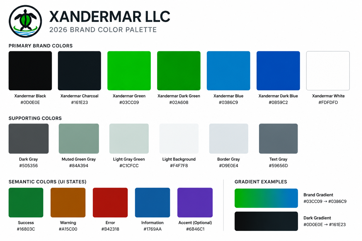
| Category | Color | Hex Code | Usage |
|---|---|---|---|
| Primary | Xandermar Black | #0D0E0E |
Logo structure, headings, dark backgrounds |
| Primary | Xandermar Charcoal | #161E23 |
Navigation, footer, panels, dark sections |
| Primary | Xandermar Green | #03CC09 |
Primary accents, buttons, highlights |
| Primary | Xandermar Dark Green | #02A608 |
Hover states, gradients, secondary green accents |
| Primary | Xandermar Blue | #0386C9 |
Links, secondary accents, informational elements |
| Primary | Xandermar Dark Blue | #0B59C2 |
Hover states, gradients, secondary buttons |
| Primary | Xandermar White | #FDFDFD |
Light backgrounds, reversed text, negative space |
| Supporting | Dark Gray | #505356 |
Secondary text, borders, interface elements |
| Supporting | Muted Green Gray | #84A394 |
Muted accents and decorative backgrounds |
| Supporting | Light Gray Green | #C1CFCC |
Subtle panels, borders, disabled states |
| Supporting | Light Background | #F4F7F8 |
Alternate page sections and card backgrounds |
| Supporting | Border Gray | #D9E0E4 |
Dividers, form fields, card borders |
| Supporting | Text Gray | #59656D |
Secondary paragraph and descriptive text |
| Semantic | Success | #16803C |
Success messages and confirmation states |
| Semantic | Warning | #A15C00 |
Warnings and caution states |
| Semantic | Error | #B42318 |
Errors, validation messages, destructive actions |
| Semantic | Information | #1769AA |
Informational messages and notices |
| Semantic | Accent (Optional) | #6B46C1 |
Optional accent color for special highlights and visual differentiation |
| Gradient | Start Color | End Color | Usage |
|---|---|---|---|
| Brand Gradient | #03CC09 |
#0386C9 |
Accent lines, hero details, graphics, callouts |
| Dark Gradient | #0D0E0E |
#161E23 |
Headers, footers, dark panels, background sections |
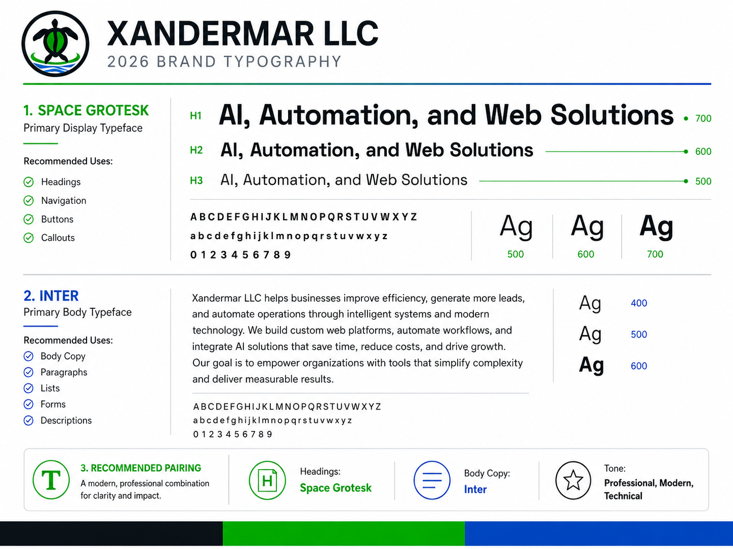
| Category | Typeface | Weight | Usage |
|---|---|---|---|
| Display | Space Grotesk | 700 | Primary page titles, hero headings, major campaign statements |
| Display | Space Grotesk | 600 | Section headings, card titles, navigation, buttons |
| Display | Space Grotesk | 500 | Subheadings, labels, callouts, statistics |
| Body | Inter | 600 | Emphasized body text, form labels, table headings |
| Body | Inter | 500 | Navigation support text, captions, metadata, interface labels |
| Body | Inter | 400 | Paragraphs, lists, descriptions, forms, long-form content |
| Fallback | Arial | Regular | Secondary system fallback when Google Fonts are unavailable |
| Fallback | Sans-serif | Regular | Final generic fallback for all typography |
| Element | Typeface | Weight | Style |
|---|---|---|---|
| H1 | Space Grotesk | 700 | Large, bold, tight letter spacing |
| H2 | Space Grotesk | 600 | Strong section heading |
| H3 | Space Grotesk | 600 | Subsection heading |
| H4–H6 | Space Grotesk | 500–600 | Supporting headings |
| Navigation | Space Grotesk | 600 | Clear, compact, highly readable |
| Buttons | Space Grotesk | 600 | Strong action-oriented labels |
| Body Copy | Inter | 400 | Comfortable line height and readable paragraph width |
| Intro Text | Inter | 500 | Slightly stronger than standard body copy |
| Labels | Inter | 500–600 | Clear form and interface labels |
| Captions | Inter | 400–500 | Smaller supporting text |
| Tables | Inter | 400–600 | Regular cells with semibold headers |
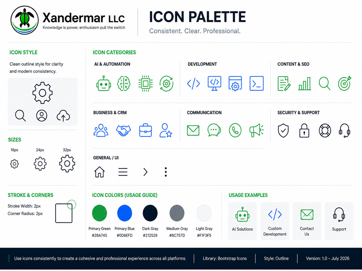
Xandermar Icon Palette
| Icon | CSS Class | Category | Recommended Use |
|---|---|---|---|
| Gear | xi-gear |
General / UI | Settings, configuration, administration, processes |
| Search | xi-search |
General / UI | Search fields, content discovery, research |
| Person | xi-person |
General / UI | User accounts, profiles, customers, team members |
| Cloud Upload | xi-cloud-upload |
General / UI | File uploads, cloud deployment, backups |
| Robot | xi-robot |
AI & Automation | AI assistants, chatbots, automated customer service |
| Brain | xi-brain |
AI & Automation | Artificial intelligence, machine learning, intelligent analysis |
| CPU | xi-cpu |
AI & Automation | AI processing, computing, technical infrastructure |
| Automation | xi-automation |
AI & Automation | Workflow automation, integrations, recurring processes |
| Code | xi-code |
Development | Software development, source code, programming services |
| Monitor Code | xi-monitor-code |
Development | Web development, application development, frontend work |
| Browser Gear | xi-browser-gear |
Development | CMS configuration, website administration, Drupal services |
| Terminal | xi-terminal |
Development | Command-line tools, DevOps, scripting, server administration |
| File Edit | xi-file-edit |
Content & SEO | Content creation, editing, documentation, publishing |
| Chart | xi-chart |
Content & SEO | Analytics, reporting, SEO performance, business growth |
| Target | xi-target |
Content & SEO | Marketing goals, lead generation, campaign targeting |
| People | xi-people |
Business & CRM | Customers, teams, audiences, CRM contacts |
| Handshake | xi-handshake |
Business & CRM | Partnerships, consulting, agreements, client relationships |
| Briefcase | xi-briefcase |
Business & CRM | Business services, consulting, professional solutions |
| Person Star | xi-person-star |
Business & CRM | Featured clients, customer success, testimonials, account management |
xi-email |
Communication | Email, contact forms, newsletters, notifications | |
| Chat | xi-chat |
Communication | Messaging, live chat, AI chatbots, conversations |
| Phone | xi-phone |
Communication | Telephone contact, callbacks, voice services |
| Megaphone | xi-megaphone |
Communication | Announcements, marketing, outreach, promotions |
| Shield Check | xi-shield-check |
Security & Support | Security, compliance, verified services, protection |
| Lock | xi-lock |
Security & Support | Privacy, authentication, secure access, protected data |
| Support | xi-support |
Security & Support | Help resources, service assistance, troubleshooting |
| Headset | xi-headset |
Security & Support | Customer support, technical support, help desk services |
| Home | xi-home |
General / UI | Homepage navigation, dashboard home, main landing page |
| Menu | xi-menu |
General / UI | Mobile navigation, collapsed menus, navigation controls |
| Next | xi-next |
General / UI | Continue, next page, read more, directional navigation |
| More | xi-more |
General / UI | Additional actions, overflow menus, secondary options |
Icon Sizes
| Size | CSS Class | Recommended Use |
|---|---|---|
| 16px | xi-16 |
Inline text, metadata, compact navigation |
| 24px | xi-24 |
Buttons, form fields, standard interface elements |
| 32px | xi-32 |
Feature lists, cards, service headings |
| 40px | xi-40 |
Section introductions, prominent feature icons |
| 48px | xi-48 |
Hero areas, major services, marketing callouts |
Icon Colors
| Color | CSS Class | Recommended Use |
|---|---|---|
| Black | xi-black |
High-contrast interface elements |
| Charcoal | xi-charcoal |
Default neutral icons and navigation |
| Primary Green | xi-green |
AI, automation, communication, positive actions |
| Dark Green | xi-green-dark |
Hover states and high-contrast green icons |
| Primary Blue | xi-blue |
Development, business, links, technical services |
| Dark Blue | xi-blue-dark |
Hover states and high-contrast blue icons |
| Gray | xi-gray |
Disabled, secondary, or low-priority interface elements |
| White | xi-white |
Icons displayed on dark or colored backgrounds |
Usage Examples
| Purpose | Recommended Classes |
|---|---|
| AI consulting | xi-robot xi-32 xi-green |
| Drupal development | xi-browser-gear xi-32 xi-blue |
| Custom development | xi-code xi-32 xi-blue |
| DevOps services | xi-terminal xi-32 xi-blue |
| Business consulting | xi-briefcase xi-32 xi-blue |
| Lead generation | xi-target xi-32 xi-green |
| Contact form | xi-email xi-24 xi-green |
| Phone number | xi-phone xi-24 xi-green |
| Customer support | xi-headset xi-32 xi-charcoal |
| Security services | xi-shield-check xi-32 xi-charcoal |
| Read more link | xi-next xi-16 xi-blue |
| Mobile navigation | xi-menu xi-24 xi-white |